

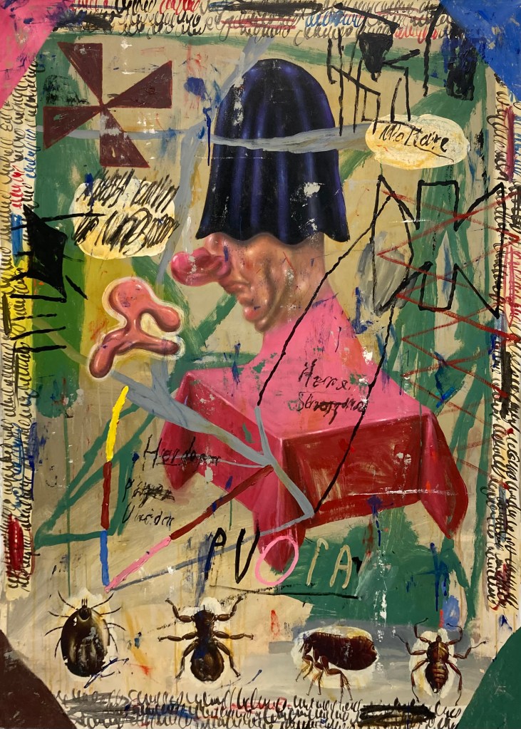
140 x 120 cm, Acrylic and Spray Paint on Canvas
Can you tell us about your journey as an artist and what initially drew you to creating art?
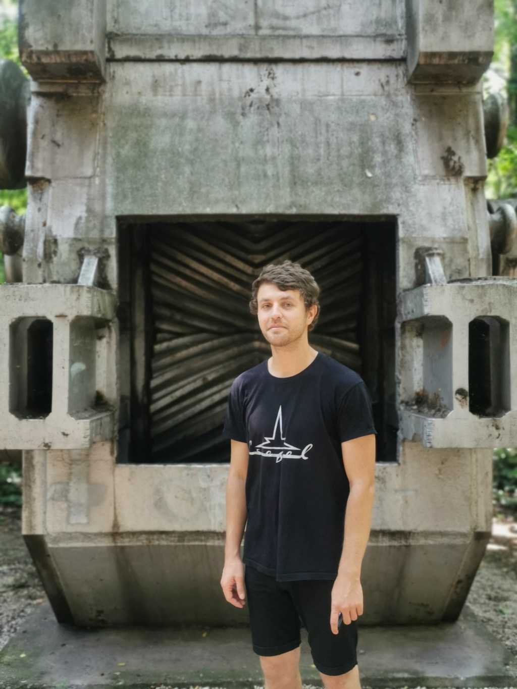
Like most kids, I started drawing frantically on a very early age. My father who worked as a civil engineer, always brought huge blueprints home, so I could draw on the back. I very much liked the seemingly infinite amount of space these large format blueprints offered me.
For some reason (even before I could read or write) I always liked words, symbols and numbers to accompany my drawings. I copied letters and numbers from the newspaper and my mom’s magazines without knowing the meaning, resulting in some sort of gibberish, but intuitively I liked the combination of text and image.
Then there was this book that I got as a kid from my grand uncle -who was a typographer and an artist- in which I found a painting that really baffled me. It was a painting by the Dutch Painter Dick Ket (Double Portrait of the Painter and His Father). What struck me about it were the hands of the painter. They were deformed and seemed way to large. I couldn’t get my head around why a painter obviously so skillful would paint those hands so wrong. Later in life I found out that Dick Ket suffered from heart failure that resulted in swollen and deformed hands. Another thing that struck me was the discrepancy in style; the painter was painted in a realistic style whereas the father was put down on the canvas in loose brushstrokes. All in all I liked the mystery in that painting. I wanted to be able to do that, but I also had a great interest in typography and printed matter, so I became a graphic designer. With some friends I started a design agency, in which experimentation was the norm. In 1999 we sold it to an American Nasdaq listed company in 1999. In with the user intelligence specialists, the strategists, the business analysts and the information architects. Out with the fun and freedom of experimentation. Creativity was replaced with rigid rationalization and bleak professionalism. I had never been paid so well, but never felt more miserable at the same time. So the very moment my contract with the company was overdue, I left.
But I was still in love with graphic design, so I set up a new design agency with some friends which lasts till today. And in addition to that, in the evening hours I was part of an artist duo, mainly focussing on digital character design. Because of that collaboration I started to regain my interest in art, art history and painting. At a certain point this project felt too limiting. I remembered the thrill I felt as a kid by looking at the Dick Ket painting and I needed a place for my own without interference from others to grow as an artist. I also wanted to be away from the computer and return to the feeling of freedom and experimentation. From that point onwards I taught myself to paint, simultaneously trying to find my own voice in painting, which took me a couple of years. Because I had to bring my ability to depict things up to speed, with my ability to imagine things.

50 x 60 cm, Acrylic and Oil on Wood Panel
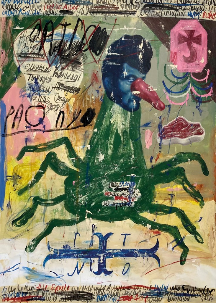
140 x 100 cm, Acrylic and Oil on Canvas
Your work incorporates a wide range of themes and influences, from art brut and folk art to pop culture and post-modernism. How do you navigate and integrate these diverse elements in your art?
As a graphic designer I never liked Swiss style modernism. I liked the “anything goes” post modern approach. That attitude is something I consciously transferred to my paintings. True to the post modern principle, I just use whatever suits me, no matter style or origin. So I infuse my paintings with non painterly elements, like typography, (graphical)symbols and signs, made up language etc, something clearly derivative from my experience as a graphic designer. In that respect I very much favor the unbridled visual urge and richness of art brut and folk art which is purely driven by personal interests and personal stylistic principles, ignorant from art history.
Being a kid from the seventies, I was brought up with the anthropomorphic world of Walt Disney and Tex Avery. I think that brightly colored world in which anything was possible, greatly influenced me. The intersection of shapes and forms and the fullness of the compositions was something I really liked. Transferring the visual attitude from that world, contradicts nicely with my somewhat mystical and dramatic subject matter. I lure the viewer into the works with the tools of communication and popular culture with a promise for resolution, but once in, the viewer is left to its own devices, free to come up with whatever associations or explanation.

140 x 100 cm, Acrylic on Canvas
Many of your pieces seem to explore the intersection of the conscious and sub-conscious, the rational and the irrational. Can you explain your approach to blending these aspects in your work?
So I like my work to be ambiguous. I bring elements together that sometimes seem to contradict. Although the work is narrative, I take care not to tell a story. I almost never sketch, I tend to start painting with no predestined plan. So the paintings always have a multitude of overpainted layers, due to the fact that the painting reveals its direction and meaning during the painting process.
I see my paintings as messages in a strange language. They appeal to a feeling rather than a predefined story. For me there’s no reason to rationalize that appeal. In spite of the narrative character of my paintings I am a formalist painter of sorts. A painting simply has to look good, according to my standards. But on a subconscious level a painting also has to make sense.
It has to be convincing on every level. Both stylistically, technically as well as pictorial, but I can’t tell how to make a convincing painting (and I don’t want to know either). I first have to make a painting, before I know whether “it” is there or not. It has to be in balance for the least. And balance is where the conscious part comes to play. My paintings stylistically range from expressionistic brushwork to a more (pseudo) classical/academic painting style. I am very much aware of how style influences the perception of what you see. For instance: when Beckman painted a grievous looking face, it’s more likely to be perceived as a social commentary, but that same face depicted in a classical/academic manner, most probably leans more towards a religious/romantic intend. It obviously also has to do with the general subject matter of the painter in particular, but still. I riff on different styles to make the paintings more interesting, richer so you will, but also to deliberately point in a (wrong) direction. The subconscious also lies in the combination of elements in a painting. I combine things intuitively. Sometimes I only understand a painting in hind site. I try not to overthink the process. TalR, the Danish painter once said; sometimes my paintings are smarter than me. I very much endorse that idea.

140 x 170 cm, Acrylic and Oil on Canvas
Humor and anxiety are recurring themes in your art. How do you balance these contrasting emotions, and what role do they play in conveying your artistic message?
My paintings appear not to be lighthearted ones, but the juxtaposition of elements, the abundance of colour, ideas and styles hopefully puts things in perspective, although I shy away from pure irony.
I try to find balance in contrasting emotions by the title of a painting. Titles are important to me. They should not explain the work, but rather complement, contrast or mystify. I make use of deliberate misspellings, made up language and the combination of different languages, mostly English and German. English, because I want to get the idea across to as many people as possible, whereas the sound of the German language makes even a word like Spaziergänger (stroller) sound profound and poetic. One of my last paintings is titled: The Present Tense of Kartoffelsalat. It came out of nowhere during the painting process, and some way or another it made sense to me as a fitting title. So I take the idea of drama and mystique very seriously. It might be an acquired taste, but mostly I get the message across.

120 x 100 cm, Acrylic on Canvas
Your artist statement mentions a fascination with superstition, rituals, and conspiracy theories. How do these elements influence your creative process and the narratives within your pieces?
I’ve always been fascinated by how people trick their minds to escape reality (for the good and for the bad). Often this delusional trickery grows into a complex of rituals, symbols and narratives that provide identity to the believers. Sometimes these systems are purely personal, sometimes they become group identities. Some of them have become institutionalized religions whereas others stay obscure and tend to become more obscure and farther from reality over time.
The contradiction of how these fabrications become factual to the believers, never ceases to amaze and scare me. The deep twisted confusion is baffling to me. My fascination to that phenomena is like watching an accident in the making; you can’t look away. My paintings are a result of that fascination. I try to make paintings as if they were icons from a cult, a conspiracy, or apocryphal add-ons to a religion. It’s a conceptual thing, rather than a style thing. and it’s fertile ground for inspiration.
Can you discuss the importance of symbolism and (secret) language in your work? How do you use these tools to communicate with your audience?
The texts and headlines in the works are (as far as they’re legible) made up language with no predefined meaning. They function as visual devices to convey an atmosphere and sometimes suggest a meaning.
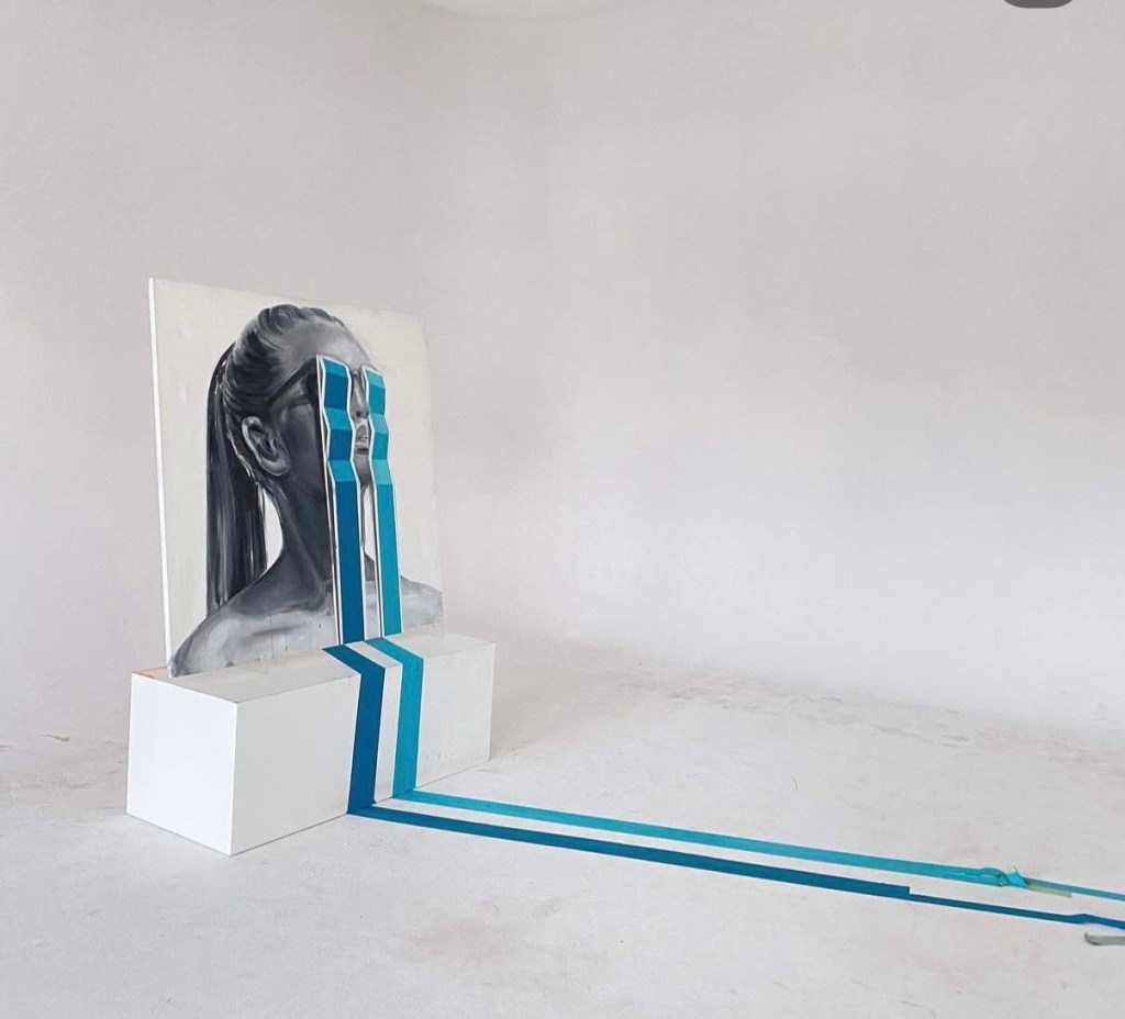
The strips of scribbled texts that are sometimes underneath my paintings or frame them, derive from 16th century cartography and prints, in which they clarify the illustration as a caption, mostly written in a script that hardly nobody can decipher anymore. The specific design of these strips of scribbled texts also refers to the folk art phenomena of Retablo, -small devotional or votive- paintings. In South America these paintings often contain a small text at the bottom that asks for fertility, healing, protection, welth etc. I like the somewhat naive superstitious function of those texts. They add to the icon-like intention of my paintings.
By using generic symbolic signs -mostly inspired by religious folk art- (teeth, candles, eyes, houses, tables, animals, crosses etc) I suggest a meaning, but these signs can’t be read semiotically. In semiotics you have the sign, the signified and the interpretant. By taking away or blurring the signified, the interpretant has to look elsewhere in the painting for meaning or has to interpret the signs contextually.
Denying a pictorial space in the classical sense of the word (pictorial depth, horizons, perspective or gravity etc.), offers me the possibility to arrange all pictorial and graphical elements as if it were a poster, so that the paintings function as an allegorical means of communication in an unknown or long forgotten (visual) language.
Your work often blurs the lines between high art and kitsch, the important and the futile. What message or experience do you hope to impart to viewers through this approach?
My interest in kitsch is in the harmful side of it. At its best it’s an oversimplification of the truth, very intentional in its meaning and uses all means necessary to convince the spectator of one singular message. It’s deceptively honest and leaves no room for doubt. As a matter of fact, it’s a very effective tactics for (mis)information, propaganda and religion. And since these things highly interest me on sociological and artistic level, I try to visually break the code in order to be able to play with singularity to obtain ambiguity.
On a purely formal level, I like the richness of the emotional and deceptive embellishment and the obvious aim to please. Unintentional visual kitsch is usually (and rightfully so) associated with lower forms of art, unable to reach a more metaphorical way of transferring a concept, although I sometimes genuinely like things that are obviously kitsch just by the way they look. By using high and low art characteristics at the same time I create the freedom to navigate different styles, which creates a pathway for different painterly approaches to leave my pictorial possibilities open ended.
I have never thought in terms of high and low art. Trying to make make high art is like looking for the recipe for gold. It’s completely beside the point to me. You either make the work or you don’t. I just paint my paintings and see what happens. I’m aware of contemporary, art history and (popular) culture and I make use of all aspects that seem useful to me. High or low, important or futile.
To put it more simple: I try to make something that is at least appealing to myself. Just trying to have a good time. Or to quote Philip Guston “I paint what I want to see”.
What advice would you give to young artists who are trying to find their own voice and navigate the complex world of contemporary art?
Finding your own voice is something directed inwards. It’s about soul searching; finding what interests you. How to make painting worthwhile and transfer that into a visual language that is personal and true to yourself. What I mean is, that (to me) there are three different pillars to creation that are evenly important. It’s style, technique and subject matter. You need to master all three of them according to your own standards, to make coherent and convincing work. When you fall short on either one of these three pillars, you either need to study or practice. First convince yourself, before trying to convince the art world. Do the work. There are no short cuts. Paint even though nobody takes notice. Paint like nobody’s watching.


Leave a comment